This blog has now moved to http://blog.gilcocker.com
and is back making regular posts again. Your browser
should direct you in the next 5 seconds to the new website.
If not, please click this link or point your browser to the new link.

Thursday, 26 July 2007

Audrey Kawasaki


Link
The portfolio of Audrey Kawasaki is absolutely amazing. There is a massive volume of work and the detail in depiction of facial features give them a strange lure. The majority of the work is done directly onto wood which really enhances the work and gives it a tactile quality.

There is also a journal by Audrey at http://i-seldom-do.livejournal.com/

See all the work at:
http://www.audrey-kawasaki.com


There also some amazing sketch book work on show.

Sunday, 22 July 2007

Marc Aurel


Hi-res photos from Marc Aurel. Some really nice touchs for this new collection website. Sit on the home pages as models hair wafts around in the air. The way the images and figures move independently of each other, especially between transitions in the photos and flip book-like navigation works really effectivly and makes the work far more engaging presentation wise.

Check it at:

http://www.marc-aurel.com/2007/

RjD2


An amazing new video for one of my favourite artists R2dj. Some great moves and a great continuous take, looks like passer bys don't have a clue whats happening. Awesome.

More info at:

Spinner

For all things Chuck


There so much stuff on the internet about Chuck Norris. Heres something you might not of been aware of about Chuck.

Tuesday, 17 July 2007

Map of the web

Great Bear version of the web. Wonder if this will stand up in a years time?

http://www.informationarchitects.jp/slash/iA_WebTrends_2007_2_1600x1024.gif

Dawid Markoff


Great collection of contemporary back and white photography. Real mix of fashion, portraits and landscape work.

Enjoy at:
http://markoff.pl/

Electorama Teaser Trailer


Heres a quick teaser trailer for the previously mentioned self directed Daft Punk movie Electorama. Looks very intriguing.

Simpsons Movie


Simpsons is on general release next week I think, but in the mean time the Simpsons movie website captures the essence greatly and theres the ability to put your self into the 2D world of the Simpsons.

http://www.simpsonsmovie.com/

DirtyDirtyDancing


I've been pretty neglect full of the old blog over the last week. So I'm getting through all the stuff I've wanted to blog about. I found this gem a few weeks ago. Cool set of snapshot photography, beautifully saturated and great depth of focus and lighting. Have a look now and again and see whats happening.

http://www.dirtydirtydancing.com/

Daft Punk


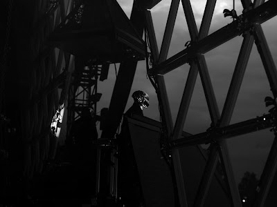
I've been reading a lot of stuff on Daft Punk recently. Following in Interstella 555, they decided to make a a movie titled Electroma. I'm yet to see it but apparently, the plot revolves around their robot mask/head motif going on a road trip in America to be turned back into humans. There's very little dialogue in the movie but I'm rather intrigued by the 70mins featurette.

In the meantime, theres an amazing set of black and white photos from one of their recent on tour gigs. Enjoy them with a little french electro (I suggest some justice or Busy P) at:

http://www.hedislimane.com/diary/day.php?m=6&y=2007&d=17

Have a look through the rest of the photos on there as well - I really like the chronological layout of it all.

NoPattern - Website redesign/new work


An old favourite of mine, NoPattern has had a redesign and new work and clothing has been put up for purchase. Check out the work at:

http://www.nopattern.com

Muse - Invinvible Album Cover

Really liking the lucid feel of the illustration on this album cover. Shame about the music. Ha

Saturday, 7 July 2007

This Film is Not Yet Rated

I watched a really good documentary on the film rating system in the USA. The doco, This Film is Not Yet Rated included some really nice animation interludes to explain points and highlight quotes and statistics. For anyone who is remotely interested in how movies are rated/censored as the doco argues it is well worth a watch if not for the quirky and engaging animations. The above is a screen grab from one animation to show the style but as the doco features mainly on why films are given NC17 (No Children under the age of 17 - sort of an 18 in the UK) the majority of content is perhaps not best for impressionable minors.

Watch a section of animation at (NC17 and 18+ suggested):
http://www.youtube.com/watch?v=dDqxuGlxbWc

Thursday, 5 July 2007

Archive of Graphic Design


A very useful resource for graphic designers over at flickr.
http://flickr.com/photos/20745656@N00/sets/

University exhibitions


Not an amazing flyer for an exhibition at Saint Martins but a vehicle for me to rant about universities. Makes me realise how bad my university is for the lack any sort of good advertisement - well thought out design - for work of undergrads not in their final year and the lack of exhibitions especially for people in Vis Com. Maybe its just that this one is in London, but for the last 3rd year (2nd year in England) work in progress exhibition, the flyers and design were so appalling and weren't even offered to be designed by a Graphic Designer (designed by a fashion designer I think). I'll try and dig out a copy and post it up online. Stupid university politics.

artschoolreject


A couple of the piece I like from italic poster creator artschoolreject. Interesting way of presenting posters as well with a drying rack. Touch of class.

Sound like no other


I really like the look and feel and the design of the characters in this short animation for Sonys new walkman campaign. I think its a real shame they had to introduce real footage/photographs towards the end - really detracts from the whole animation.

Have a look at it:
http://www.santamaria.tv/sony/0625_SM_red_sony_LO2.mov

Witty Italics

This says witty to me, a really difficult thing to get exactly right.

You can order them online at artschoolreject by emailing them directly. An interesting portfolio site as well.

Anyone for a game of mario?


Very very very coolio. Nothing more.

See it all at
http://www.craftster.org/

Wednesday, 4 July 2007

Swiss Legacy


A really engaging blog on typography primarily by Swiss designers but does an encompass other parts of Europe as well. Quite a bit of stuff on the legendary typographer Wim Crouwel - I think hes done some amazing work personally.

Also an interesting layout for the blog - very Swiss.

http://www.swisslegacy.com/

Kitty-Craft fabrics

Check out some of the cool printed fabrics on offer at Kitty-Craft. Might have to pur-chase some for a few wee projects and book binding things. Delivery isn't too bad considering.

Kitty-Craft

Benice2mice - Crochet Food


Very very very cool. I don't know much about this item apart from being sent it from Dan at my last work experience - kudos Dan. Hopefully I'll find out a little more about their construction at a later date when I get round to emailing the person behind them.

They look pretty amazing and so tactile - they really remind me of the Blur video Coffee and TV (amazing and well worth watching, see the end of the post) and a bit of the opening titles of Napoleon Dynamite (again see end of post). From my very little knowledge of crochet they look very detailed and must be reinforced with some skeleton - make me really want to know how to do them though - can't be that hard being a fairly good knitter.

Hopefully I'll have more news at a latter date and maybe post some more of my knitted stuff? We'll see.

Benice2mics flickr at http://www.flickr.com/photos/66187156@N00/


Blur - Coffee and TV Video


Napoleon Dynamite Opening Credits

Many Stuff - Address Change

Although a little late now, the amazing Vis Com blog ManyStuff has changed its web address. I highly advise you checking it daily as it has such a wealth of fresh work from very talented people.

The new address is:
http://www.manystuff.org/

For the more lazy creatives...


For the more lazy creatives among us, Scrapblog lets you create interactive scrapbooks for just about anything using the intuitive online interface. Though its a bit cheesy and by no means a substitute for a good old fashioned cut a paste book of your latest excursion or exploration on the high seas, its a nice little web app that plug in to plenty of web 2.0 sites such as facebook and flickr make it a quick and easy task - even better there no registration required and once your done you can email it to friends or publish it on your blog. I think it's defiantly one for the web 2.0 lovers who don't quite get the same enjoyment of peeling PVA off your fingers.

Have a look at the tour at:
http://www.scrapblog.com/tour/tour.aspx

Monday, 2 July 2007

Real life Kwik-E-Mart - CA


This is a pretty coolio PR stunt for the imminent release of The Simpsons movie release in the USA. Wish I was going to CA sometime soon. I think my brother is going to be in that neck of the woods soon so maybe I can get him to take some photos/videos if he goes.